A few weeks ago I promised my faithful readers that a revamp of the Digital Farm was in order. Don’t worry I haven’t forgotten, it is on its way, it’s just taking a little bit longer than I first expected.
When I first decided to re-design my site I thought it would be a quick job: a few pretty, photoshop-edited jpegs, a little tweak of the CSS stylesheet, and a few extra buttons. Easy!
I then started doing some research, I studied some sites that had been revamped for the CSS Reboot, and found some creative inspiration. Some pretty imagery just wasn’t going to do it. A complete revamp of not only the design, but also the usuability was in order.
Google Analytics has proven to be very helpful, and well worth the installation a few months back. With my statisitics I get I have been able to really research the usuability of my site. It has so much functionality that informs me of just about anything I need to know about my visitors, their location, their likes and dislikes, where they are coming from, and where they leave my site to go.
The picture below for example informs me that the “Login” button is not used at all, and is best described as a waste of space. A very small number of readers have actually registered as a subscriber to my site, in fact only one person has! I don’t blame any of you either, a “subscriber” does not benefit at all from registering, he/she cannot view anything more than you can as a website visitor. Therefore this button is going to be replaced with a more usuable button, that entices the reader to venture deeper into my site.
The “Contact me” button gets a few hits each day, but could probably be replaced with something a little more attractive, a little more appealing to the readers. The “Contact” button will be moved to the sidebar.

Google also helps me establish where exactly my visitors are from. Not what country, but what city. I can even see your IP address. I’m watching you… just kidding, but it is quite scary to see how much information is avaliable to the webmaster.
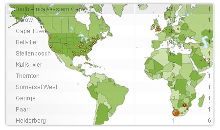
This information helps me decide on what articles to publish. Seeing my visitors are mainly South African I can get away with local articles on the pitfalls of Telkom and Capetonians despise Eskom.
The stats also show me that linking to my previous articles in similar current articles, like I have just done, keeps my visitors interested in my site, lengthening their time on this site, and reducing their exit points. Pretty neat hey?

I can also see that my archive menu in the sidebar is seldomly used. Today, for example, only 1 person has clicked on one of the archive buttons. Why? Because people would far rather click on a category, for example with the name “Digital Art”, then click on a button called “May 2006”. By clicking on “Digital Art” they know what they are going to get articles about, with the archive button “May 2006” they are not enticed to visit it by some attractive label.The archive is therefore going to be replaced with a single “Archive” button, where they can navigate and manipulate their search from a single dynamic page.
That brings to an end my two cents worth about the Digital Farm site usuability thus far. As you can read this site revamp should hopefully be an exciting one.
This usuability study has been a great learning experience for me, I now plan to use the knowledge I have gained here on some of our client’s websites and hope to see some great results.
Should you wish to read about the design aspect of this revamp, then let me know by commenting, otherwise I don’t wish to bore you all with infomation you don’t really want.
Expect to see the new site up and running soon 🙂
8 responses
No sneak-peak screenshots?
i know what u mean about thaking “longer than expected”… same story over @ SomeNoOne. It’s been almost a month since the reboot and the portfolio and archive section is still “work in progress”… not to mention anything bout the IE bug.
I’d love to give you one, if I had one, still playing with a colour combos so nothing concrete yet. I’ll keep you in suspense.
IE bugs are a never ending story, ironing out a few CSS issues.
Man, looking forward to seeing the redesign. I’m impressed that you went into your website metrics to really figure out the user patterns. I’ve been running Google’s web analytics since November on mine, and I find them useful as well.
So, who’s redesign comes out first, yours or mine?
Hey Forest…
Cool Article man!! Must say Googles analytics is sweet…dig the Map!! See you have a few fans in Saudi Arabia!! lol interesting…
Ciao
Keg
Its a race to the finish line hash 🙂 Looking forward to seeing yours!
Thanks Keg, hoping my Saudi Arabian mates will leave a comment next time they here!
Please DO bore us with the details, I think there are lots of people out there who could benefit from just a small glimpse of what goes into really designing (and not just graphically designing) a site.
Also, us fellow designers/architects/developers would love to leach your brainpower!
Mark, well it looks like you’re going to beat me to the redesign. I’ve officially sidelined mine until I get back from Kenya in July. Just to much else going on to really ensure that this gets done right.
I’m interested to see what you come up with though!
[…] As promised, and without any further delay, here is the analysis of the Digital Farm re-design (Part 1 can be viewed here). […]